What is Product Listing Page (PLP)?
A Product Listing Page (PLP) is a web page or section of an e-commerce website that displays a list of products available for purchase based on a category or search query. It is an essential part of the online shopping experience, helping users browse and compare products before making a purchase decision.
This page plays a crucial role in enhancing the overall e-commerce journey by guiding website visitors toward individual product pages and bringing them closer to making a purchase. Often referred to as “category pages” or PLPs (Product Listing Pages), these pages are also rich in metadata. Since each product links back to its respective category page, they have a significant impact on SEO rankings and strategies for internal link building.
In today’s e-commerce landscape, the majority of web traffic is directed toward product listing pages, whether through email campaigns, social media, or advertisements. Consequently, it is vital to ensure that the PLP experience is carefully created to achieve the following objectives:
- Facilitates product discovery
- Reduce the time it takes for users to make a purchase
- Encourage user engagement
With potentially hundreds or even thousands of products listed, users should be able to efficiently and swiftly navigate and sort through the search results.
Key Features and Elements
Product Thumbnails: PLPs typically feature small images or thumbnails of the products. These images give users a visual preview of the items available for purchase.
Product Titles: Each product listed on the PLP has a title or name that describes it. This helps users quickly identify the product they are interested in.
Product Prices: The prices of the products are usually displayed prominently. It’s common to see both the regular price and any discounted or sale prices.
Product Ratings and Reviews: Some PLPs include ratings and reviews for each product. This allows shoppers to see what other customers think of the product and make more informed decisions.
Filter and Sorting Options: To make it easier for users to find the products they want, PLPs often include filter and sorting options. Users can filter products by category, price range, brand, size, color, and more. They can also sort products by price, popularity, or other relevant criteria.
Product Descriptions: PLPs may include brief product descriptions or summaries that provide essential information about the product’s features, specifications, and benefits.
Add to Cart or Buy Now Buttons: Each product listing typically includes buttons that allow users to add the item to their shopping cart or proceed directly to checkout (Buy Now).
Pagination or Infinite Scroll: Depending on the number of products available, PLPs may use pagination (numbered pages) or infinite scroll (loading more products as the user scrolls down) to help users navigate through the product listings.
Product Availability Information: Users may see information about whether a product is in stock or out of stock. Some PLPs also display estimated delivery times.
Visual Merchandising: E-commerce websites often use visual merchandising techniques on PLPs to showcase featured or promoted products, seasonal items, or special offers.
Breadcrumbs: Breadcrumbs are navigation links that show users their current location within the website’s hierarchy. They help users understand where they are in the product catalog.
Filtering and Sorting Controls: PLPs provide controls such as checkboxes, sliders, and dropdown menus to allow users to customize their product search results based on specific criteria like price, size, brand, and more.
Mobile Responsiveness: A well-designed PLP is responsive to different screen sizes, ensuring a good user experience on both desktop and mobile devices.
Call to Action (CTA): PLPs often include persuasive CTAs that encourage users to take action, such as “Add to Cart,” “View Details,” or “Shop Now.”
Thumbnails and Hover Effects: When users hover over a product thumbnail, additional information or alternate images may appear to provide more context.
PLP Design
Designing an effective Product Listing Page (PLP) is crucial for e-commerce websites as it directly impacts the user experience and can influence purchase decisions. Here are some key design principles and elements to consider when designing a PLP:
Clean and Consistent Layout: Maintain a clean and consistent layout throughout the PLP. Consistency in elements like product cards, spacing, and typography helps users navigate the page more easily.
Thumbnail Images: Use high-quality thumbnail images that clearly represent each product. Ensure consistent image dimensions and alignment for a visually pleasing display.
Category Title: The persistent top navigation menu appears consistently on all site pages, while on a Product Listing Page (PLP), a design element is incorporated to emphasize the specific category to which the currently viewed PLP belongs, providing improved shopper orientation.
PLP Page Name: Typically, the PLP page name is prominently displayed in the category section or at the top of the page. Furthermore, the number of products that meet the PLP criteria is typically indicated somewhere on the page.
Pages: Users can explore numerous pages if the PLP contains a sufficient number of SKUs that meet the criteria. Additionally, shoppers can customize their browsing experience by selecting to view 10, 50, or 100+ products per page.
Browse By: In cases where a PLP includes sub-category pages nested beneath it, users can easily navigate to more specific category pages by utilizing the browse-by menu bar.
Product Titles and Descriptions: Clearly display product names and include concise descriptions or key features. Use legible fonts and appropriate font sizes for readability.
Pricing Information: Display product prices prominently near each item. Highlight any discounts or special offers.
Filtering and Sorting Options: Provide intuitive filter and sorting options, typically on the left or top of the PLP. Include checkboxes, sliders, and dropdowns for filtering. Allow users to sort products by relevance, price, popularity, and other relevant criteria. These options encompass “Featured,” “Price: Low to High,” “Newest,” and “Rating: High to Low.”
Mobile Responsiveness: Ensure the PLP is responsive to various screen sizes, particularly for mobile devices. Use responsive design principles to adapt the layout and content for smaller screens.
Product Ratings and Reviews: If available, display product ratings and the number of reviews. Include a link to read full reviews if applicable.
Add to Cart/Buy Now Buttons: Place clear and prominently visible “Add to Cart” or “Buy Now” buttons on each product card. Use contrasting colors for these buttons to make them stand out.
Pagination and Infinite Scroll: Choose between traditional pagination or infinite scroll based on user preferences and the number of products. If using infinite scroll, provide a clear loading indicator as users scroll.
Product Availability Status: Indicate product availability, including “In Stock,” “Out of Stock,” or estimated delivery times.
Visual Merchandising: Highlight featured or promoted products with special visual treatments. Use banners, labels, or badges to draw attention to new arrivals, bestsellers, or sale items.
Breadcrumb Navigation: Include breadcrumb navigation to help users understand their position in the product hierarchy and navigate back to previous categories.
Hover Effects: Implement hover effects that reveal additional product images or information when users interact with a product card.
Loading Performance: Optimize the PLP for fast loading times to minimize user frustration. Use lazy loading for images to improve page speed.
Accessibility: Ensure that the PLP is accessible to all users, including those with disabilities. Use proper HTML markup, alt text for images, and ARIA attributes.
User Testing: Conduct usability testing to gather feedback and make iterative improvements based on user behavior and preferences.
A/B Testing: Experiment with different design variations using A/B testing to determine which layout and features perform best in terms of conversion rates and user engagement.
Why Does PLP Matter?
First Impression is the Last Impression that perfectly fits PLP. PLPs are often the first pages that visitors see when they land on an e-commerce site. A well-designed and organized PLP can make a positive first impression, enticing users to explore further and potentially make a purchase.
PLPs are navigation hubs for users to browse and search for products. They provide filters, sorting options, and search bars that help users quickly find the products they’re interested in. Effective navigation can significantly improve the user experience and increase the likelihood of conversion.
PLPs offer an opportunity to showcase a wide range of products to customers. Well-designed PLPs can facilitate product discovery by displaying featured, new, or related items, helping customers discover products they may not have initially searched for.
Engaging PLPs can keep users on your website longer. Features like product images, descriptions, user reviews, and interactive elements (such as quick view, color swatches, and product comparisons) can encourage users to interact with the products and gather more information before making a decision.
Search engines often index PLPs, making them essential for search engine optimization (SEO) efforts. Optimizing PLPs with relevant keywords, meta descriptions, and product titles can improve their search visibility and drive organic traffic to your site.
With the increasing use of mobile devices for online shopping, mobile-friendly PLPs are crucial. They need to be designed to provide a seamless experience on smaller screens, ensuring that mobile users can easily browse and purchase products.
PLPs play a vital role in the conversion funnel. By optimizing the layout, product placement, and calls-to-action on these pages, you can increase the likelihood of users adding products to their carts and completing transactions.
Advanced e-commerce platforms use PLPs to deliver personalized product recommendations based on a user’s browsing and purchase history. This personalization can boost conversion rates by showing customers products that align with their preferences.
E-commerce businesses often conduct A/B testing on PLPs to evaluate different layouts, designs, and content strategies. This helps identify what resonates best with users and can lead to improvements in conversion rates.
PLPs are where product availability and stock information are displayed. Accurate stock levels and inventory management on these pages help prevent frustrating situations where customers attempt to purchase out-of-stock items.
In a competitive e-commerce landscape, well-optimized PLPs can set your business apart from competitors. A superior user experience and effective product presentation can attract and retain customers.
Best Product Listing Page Example
Below are some examples of well-designed product listing pages that showcase various approaches and features to inspire your own designs:
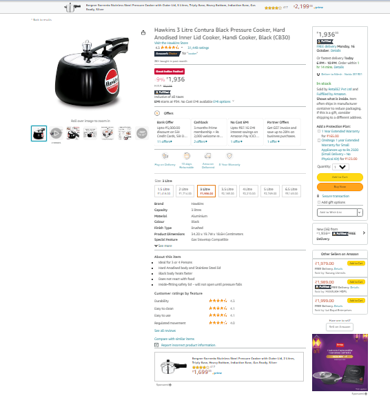
Amazon: Amazon’s product listing pages are clean, organized, and provide a wealth of information. It includes high-quality images, detailed product descriptions, customer reviews, and frequently bought-together items. The layout is user-friendly and encourages shoppers to explore related products.
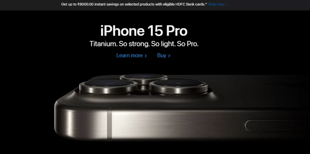
Apple: Apple’s product listings are known for their minimalistic and sleek design. It features large, high-resolution images, concise product descriptions, and clear calls to action for purchasing or learning more about the product.
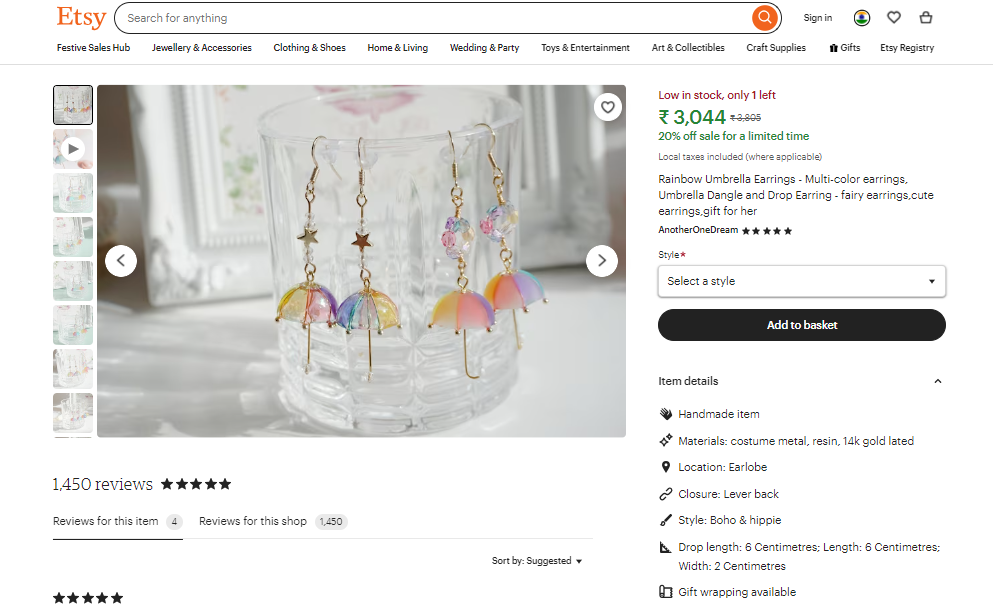
Etsy: Etsy’s product listing pages cater to unique and handmade items. It includes multiple images to showcase different angles and details of the product, as well as seller information and customer reviews. The design emphasizes personalization and connection with the seller.
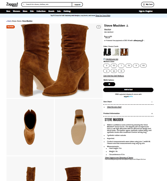
Zappos: Zappos’ product listings are known for their extensive filtering options, allowing users to refine their search based on various criteria such as size, color, and price. It also features a 360-degree view of shoes and detailed product information.
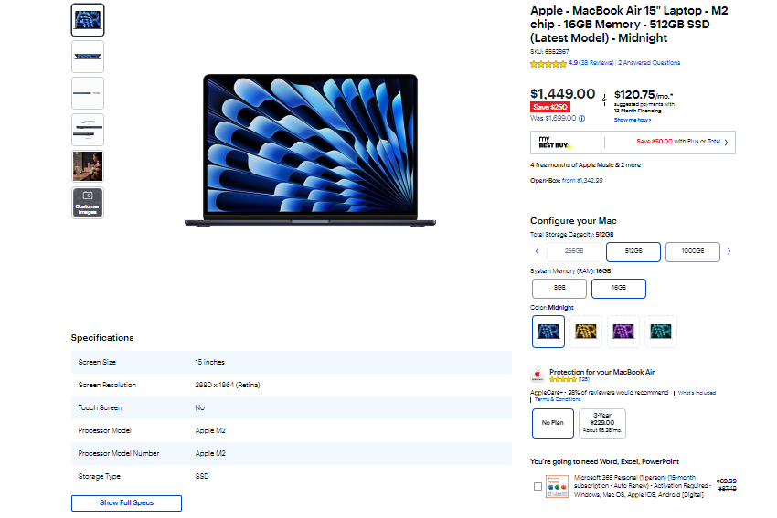
Best Buy: Best Buy’s product listing provides in-depth technical specifications and customer reviews. It also includes options to compare similar products, which helps customers make informed decisions. The layout is clean and easy to navigate.
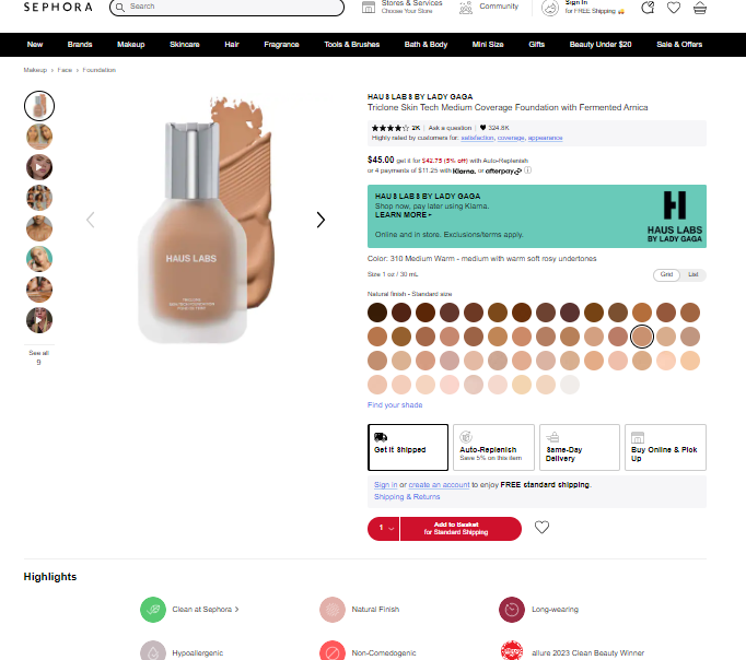
Sephora: Sephora’s product listings for beauty products are visually appealing and interactive. It includes swatches, videos, and tutorials to demonstrate product usage. The design prioritizes a seamless shopping experience.
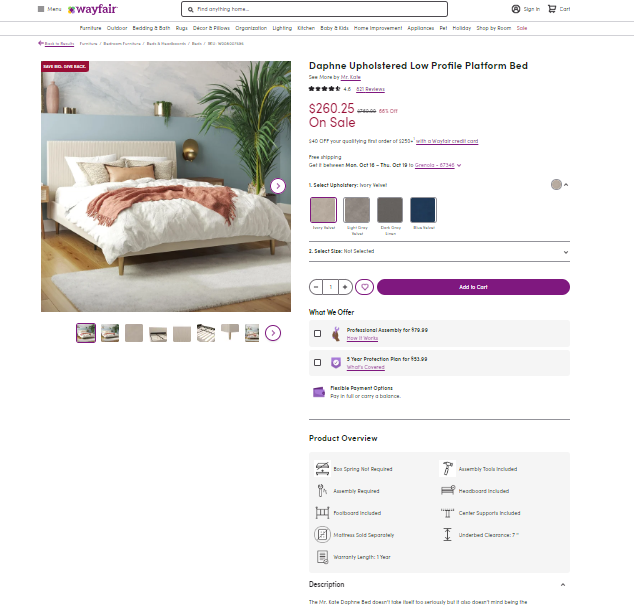
Wayfair: Wayfair’s product listings for furniture and home decor products include lifestyle images that help customers visualize how the product would look in their homes. They also offer customer reviews and detailed product information.
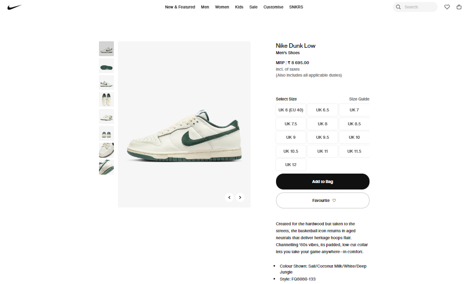
Nike: Nike’s product listings for athletic gear and footwear are image-focused and dynamic. They showcase the product in action and allow customers to customize their items. The design embodies the brand’s athletic and energetic spirit.
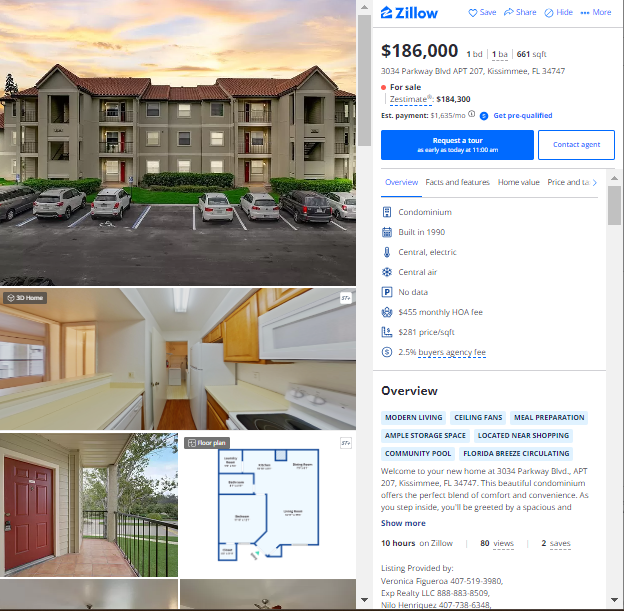
Zillow: While not an e-commerce site, Zillow’s property listings provide an excellent example of presenting information for real estate. They include high-quality images, property details, neighborhood information, and mortgage calculators, all aimed at helping potential buyers make informed decisions.
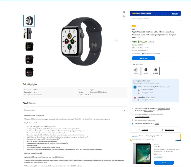
Walmart: Walmart’s product listings offer a balance between information and simplicity. They include clear product descriptions, pricing, and customer reviews. The design focuses on readability and ease of use.
Conclusion
In conclusion, the Product Listing Page (PLP) plays a crucial role in the e-commerce user experience. It is the first point of contact between customers and a brand’s product offerings. A well-designed PLP not only showcases products effectively but also enhances navigation, filtering, and search capabilities, making it easier for users to find what they are looking for. Additionally, a user-friendly PLP can significantly impact conversion rates and customer satisfaction, ultimately contributing to the success of an online store. Therefore, investing in optimizing and continuously improving the PLP is essential for any e-commerce business striving to provide a seamless and enjoyable shopping experience for its customers.